Oct 27 2008
A Graceful Remake
My original card just wasn’t cutting it for me — nothing terribly wrong with it — but it just looked plain, unfinished. This original card was made for a color challenge at SCS a few months backand I uploaded it over there, but never did post it on my blog as I just felt it wasn’t quite *right*. So this evening I decided to try to do something about it. Let me show you the original, the remake, and then I’ll explain what I did.
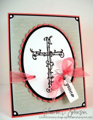
I just thought it was so plain, something was lacking, maybe the colors were poor choices for this card — here’s the remake I did this evening.

I think it’s a huge improvement — how about you? My remake is large, a full sheet folded in half, so its 8.5 x 5.5. I took my original card and cut the front of the card off — and there you go, an image panel to work with! The only thing I did to that image was to add the black pearls. I think you can see them better here.
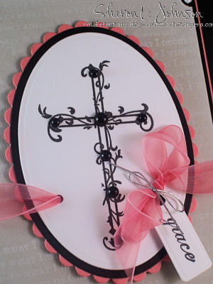
Just a little thing, but they added a lot! I then white embossed my sentiment along the bottom of my new card front, scored a partial line a little above my sentiment using my Scor-It. It adds so much IRL, but is barely visible in my photo above — but if you look real closely you can see it. I then adhered my image panel to the card and I was done! A remake that made a dramatic difference (in my opinion anyway), but took only a very short amount of time. I do feel so much better about this card now!!!
Stamps: Cross of Christ by Our Daily Bread, Graceful Wordsby SU
Paper: Cameo Coral, Sahara Sand, Black, White
Ink: VersaFine Onyx Black, Craft White, VersaMark
Accessories: Petite Oval Nestabilities and Tag dieby Spellbinders, Scor-It, White Embossing Powder, Ribbon, Cording, Pearls, Mounting Tape, Cropadile, Eyelet, Ticket Corner Punch
That does it for tonight again! Thanks again so much for taking your time to stop in. I truly do appreciate it!!! Wishing you all awonderful week ahead!
20 responses so far


So gorgeous! I love how you added those black pearls. Something so little but adds SO much! TFS!
WOW! What a big difference this change makes it was very nice before but after it really is special.
Love the second one Sharon.. Just a few tweaks and an amazing transformation. Have a great week too.!!
Sharon, your remake is just beautiful! It is amazing what a difference colors can make and just those little extra things gives it a new look!
Joan
Nice remake Sharon, I especially like the black pearls.
Girl, I think you’re loco! Both cards are fabulously (is that a word?) gorgeous! Truly Sharon, the first card is a beauty! I love the second version as well. I think you’ve got the midas touch . . . everything you touch turns to gold!
When I saw the first one, I thought, well, that’s pretty! But the second is really gorgeous. It’s a beautiful card and I’m sure he will feel appreciated!! Should go make one for our pastors….!!!
This is so stunning!! The black really makes it all pop and the Scor-It line and sentiment help to balance the whole card. Love it!!! Thanks for sharing
It’s amazing what the small details make a card go from simple to stunning. Your cards are always so lovely. Love the black pearls and the ribbon inside the oval.
Shirley L.
Roseville, Ca
Both are very beautiful, but I DO love the addition of the pearls!! Gorgeous!!
Beautiful card.Love then both,but the second one give look better.Love the black pearls.
Sharon, I absolutely love those cards. The remake is an elegant beauty.
TFS
I love them both….but the “Rejoice” adds so much to the card! Such a beautiful card, with such beautiful meaning….thank you!
Wow. The card looked great before, but with your changes it is really outstanding!
I’ve been doing some remaking, too! Amazing what a difference it can make. I absolutely think the 2nd one is better. It really POPS! 🙂
Hi Sharon! I think it is a gorgeous card. You really made a huge difference adding the black. Now it has oomph! I thought I was the only one who ripped their cards apart after looking at them for a while! LOL
Wow, now it really pops!! A beautiful card! AND now we know the secrets when we get the bigger cards, I know that happens to me too! Thanks for the before and after!!
Gosh, Sharon, I would have thought the first card was just beautiful, but seeing the remake–wow! The second card almost looks like a beautiful prayer book or something of the sort. It’s just stunning! Thank you for sharing your wonderful ideas!
I really love them both, you did a wonderful job. The new one make a more “stand out” WOW! It pops off the card more to me. However, again I think you did great on them both. Thanks for sharing.
I went to their website and I could not find this cross. I hope it isn’t retired.