Mar 27 2010
A Winner, A Sale & SU Color Comparison
I was honored to be able to supply a Blog Candy offering for the recent Mega March Just Rite Blog Hop. The winners for Day 2 have now been chosen! You can check out links to all the winners at the JustRite Blog.
Thank you ALL so much for participating in the Day 2 HOP. LOVED hearing from all of you!!!
______________________________
A 10% OFF SALE
The Stamp Simply Ribbon Store has ALL JUSTRITE PRODUCT on sale for 10% OFF.
The Stamp Simply Ribbon Store has ALL RIBBON BY THE SPOOL on sale for 10% OFF.
This sale runs through 3/31/10.
Email me at [email protected] to order. Remember to include state/zip and/or Country.
______________________________
A COLOR COMPARISON
Several of you have written asking how the colors on the 1/2″ Wrinked Ribbon match up with SU cardstock colors. I sell this ribbon by the spool only. It contains 50 yards of 1/2″ Wrinkled Ribbon and normally sells for $12.95 a spool. It is now on sale for $11.66 per spool. This ribbon is fun! It ties up easily and looks FAB. The 1/2″ width is something I haven’t had before, and a width a lot of you have asked for. The ribbon is super light weight. I like to compare the look to my FAV 100% Silk Ribbon. And I say that rather loosely as this is NOT Silk, but gives somewhat the same look and feel to a project at a mere fraction of the cost. It is heavier than the silk, but still very lightweight, and stiffer than the silk, holding a bow well. The reports coming in from ladies who have purchased it already are FABULOUS — they are all loving it — telling me my photos or text do NOT do this ribbon justice — LOL — I’m trying!!! So here’s some new photos and my comparisons to SU cardstock colors:
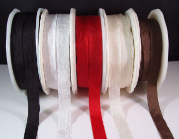
Black, White, Red, Ivory, Brown
These are about perfect matches to SU’s Black, White, Real Red and Very Vanilla. The Brown ribbon is DARKER than Chocolate Chip, but still works very well with it.
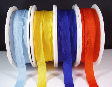
Blue, Yellow, Royal Blue, Orange
Blue and Yellow are about perfect matches to Bashful Blue and YoYo Yellow.
The Royal Blue and Orange and very good matches to Brilliant Blue and Only Orange, though both ribbons are slightly DARKER than the cardstock, the color is right.
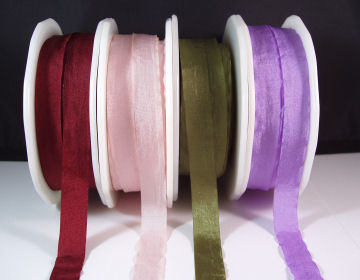
Burgundy, Pink, Olive, Lavender
The Burgundy ribbon is a decent match to Bravo Burgundy, though the ribbon is more intense in color, it still works well.
The Pink is a perfect Pink Pirouette, lighter than Pretty in Pink.
The Olive is NOT Old Olive, no where close. It is very close to Always Artichoke. This ribbon works very well with either Mellow Moss or Always Artichoke.
This is a great Lavender and it works wonderfully and equally as well with either Lavender Lace or Lovely Lilac.
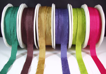
Green, Plum, Moss, Periwinkle, Parrot Green, Fuchsia
These colors have no SU match that I am aware, though I do NOT have the current IN COLORS. So sorry. These are great colors that go well with so many of the non-SU Designer Papers on the market today. The Plum could really be used with Bravo Burgundy. The Moss is not a mossy color IMO. It is more goldish with a mossy hint perhaps. And the Periwinkle, Parrot Green and Fuchsia are GREAT spring colors that I LOVE, matching many of today’s DP’s.
Hope that helped those of you wanting SU matches. They will remain on sale for 10% OFF only through 3/31/10. Thanks for stopping in! I’ll be back REAL soon with a project to post. Have a wonderful weekend everyone!
5 responses so far


Oh, how I want one of every color! ð I’m wondering if the Fuschia wouldn’t match Melon Mambo?
Mmmm, me too, I want some just like Tammy, and the Green looks almost like Bermuda Bay!
The colors are yummy……have missed those spring time colors…. now that spring is here……hope to see those colors outside.
What gorgeous colors, and thanks for matching them up to Stamping Up ð
In the last photo, I am thinking the “green” is very close to the new Bermuda Bay and the last dark pink is definitely Melon Mambo as Tammy suggested. The second to the right is a great match for Kiwi Kiss (some of us have a huge supply of that left!). All of these are yummy. You have THE BEST ribbon!!!!