Aug 26 2010
Stamp Simply #154 – A Color Challenge
A Color Challenge – Today’s colors are rich and so pretty together as we transition from summer into autumn. And autumn comes earlier to some of us than others. Our colors are Turquoise and Orange, with White OR Ivory as your netural and as always, adding Black for a little POP is totally OK, but not required. Here’s a photo of an inviting boy’s room to get your colorful and creative juices flowing.
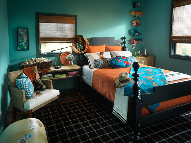
This is one of the bedrooms in HGTV’s Dream Home 2010. Photo was taken from this site and you may click here to to see more of the rooms nice and close up – FUN!!!
Anyone is welcome and invited to play! SCS Keyword is ssnotime154 for those who upload at SCS. There is no time limit. You can play this challenge anytime at all. The point is to keep it simple, quick and have fun!!!
And be sure to Link to Mr. Linky below.
Check out the fab samples on the blogs of the Stamp Simply Challenge DT:
Charlene Driggs: Paper and Ink Playground - August Guest Designer
Deb Neerman: Paper, Ink, Scissors & Stamps
Barbara Anders: Paper Pursuits
Jenny Gropp: One Krafty Kat
Janine Orchard: 2bKrafty
AJ Otto: The Willow Garden (not playing today)
Deb Saaranen: Dream In Color
Barb Schram: Explore. Dream. Discover (not playing today)
Please bear with us all as we each upload and link on Thursday night. Everyone should be up and set by Friday morning.
You may see all SCS Gallery Submissions here.
And here’s my card for today:
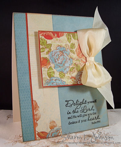
I used scraps to make this card — just had a notion to try that, and it worked, I think! The background blue/turquoise papers are from Peachy Keen by Kaiser, and the remaining papers are from Devonshire by Kaiser. (All papers can be seen here.) It was fun to combine papers from these 2 pads and they worked together wonderfully! The floral square and long ivory/rose strip were the scraps that I just accented with the darker orange. Some papers are just too pretty to cover, so I used it for my focal image! Doing that saves time, too!
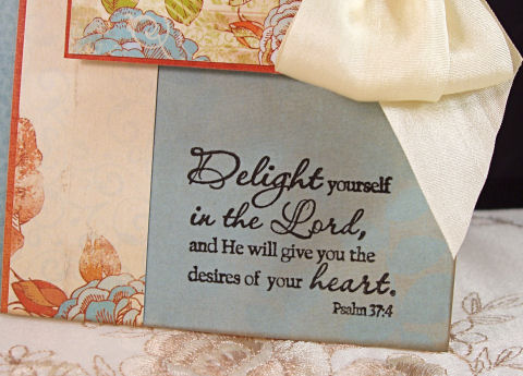
My sentiment is Psalm 37:4 — a Plain Jane by Verve which I’m so pleased to be carrying now in The Stamp Simply Ribbon Store. You may see all 20 of the verses of Scripture that I carry on this post. They sell for $3.00 each. LOVE these Plain Janes!!! I used my fav black ink for crisp, clean sentiments — VersaFine Onyx Black. The ribbon is 100% May Arts Silk and the bow is a double bow made made on the largest legs of the Bow Easy.
All items used are available at The Stamp Simply Ribbon Store. To order, just email me with your list, state/zip OR country and I’ll get back to you with an invoice.
Thanks much!
__________
Thanks much for dropping in again today! I love when you do. And I hope you can find time to play with us if you are so inclined! I plan to be back on Saturday with a simple card in a bit more masculine, or earthy style than I typically gravite towards – LOL!!! And I do have more new colors of Primas to show you — so hope to get that all posted on Saturday. Have a wonderful week, everyone — and hope to see you soon!
19 responses so far


Oh, Sharon, this is such a BEAUTY!!! The papers are gorgeous and that yummy ribbon…{sigh}..fabulous!! Hugs, Sabrina
Funny–we used the very same paper for such very different cards! Love your soft and pretty design!
It’s beautiful Sharon, love the colors, LOVE the bedroom . . . LOL! Way too cute! I’m working on something with these colors, but it will be days before it’s ready to blog. Better late than never . . . right!
Ohhhhhh…. this paper is perfect— why didn’t I think of it!!! Beautiful, Styled and Elegance as always!
Just beautiful, Sharon! Love that pretty DP, your yummy ribbon, and that wonderful stamp! A perfection tri-fecta!
Gorgeous, as usual…love the ribbon!
You just never cease to leave me jaw dropped, Sharon! Another totally gorgeous creation. You took that bold boys room and made it soft and feminine. Awesome!
Thanks for the opportunity to play along with your talented group of designers this month! You’re the best!
Pretty!!! Have a fabulous weekend Sharon!
So pretty-really like how you used the pretty dp as a focal point. tfs
This is beautiful. Love the papers/colors and the fact you used them as the focal point. Great sentiment as well.
Gorgeous card, Sharon! I love the DP and the stunning bow! Wonderful design! I linked my try with the colors. Thanks for the challenge and inspiration!
Have a great weekend!
thanks Sharon, I adore these colors together…here is mine…
http://enjoythevasunshine.blogspot.com/2010/08/cool-caribbean-peach-parfait-shabby.html
have a fabulous weekend!
enjoy *~*
Heheh – I also used the same Kaisercraft papers! They’re so very appropriate here… I love this inspiration, thanks for another wonderful challenge!
Your card is so pretty and feminine, Sharon!! I love it!!
Ah Sharon – the colors are wonderful – your card is beautiful! Is the paper still available??? I reall like the flowered paper’s color combo. Thanks for the inspiration
Sharon, this is so pretty! I love that you used this paper, LOL! Simply wonderful sentiment.
Fun colors. I really liked how my card turned out. TY
I love these colors! Here is mine… http://notimetostamp.blogs.splitcoaststampers.com/2010/08/26/stamp-simply-154-a-color-challenge/
Thanks for the inspiration! ð